The artists represented at Kate Owen Gallery have a magnificent sense of colour. They instinctively use original and vital colour in a balanced and harmonious way on the canvas. Most of us, however, are not so lucky. Sometimes we feel that we have a colour scheme for the home or office, but often, however hard we try, it just doesn’t come off or doesn’t feel ‘complete’. We can also get stuck in a rut and not know how to stop repeating much the same colour scheme every time.
Being able to understand the terms and processes with colour will help you knowledgeably communicate your vision. So in this article, we’re going to give you a crash course on colour! Hopefully it will help you use colour more adventurously and with confidence. You may well disagree with some of my ideas and conclusions. Please blame this on the fact that colour appreciation is personal and subjective; so much a matter of personal taste and feeling, and I can only state what I myself feel to be true.
The whole of this blog article is concerned with colour, but there can be art without it. The lack of colour does not make a master drawing less a work of art. Picasso’s ‘Guernica’, possibly the most profound painting of the last century, is in black and white. View our range of black and white artworks here.
The Basics:
Colour is perception. Our eyes see something, and data sent from our eyes to our brains tells us its a certain colour. Objects reflect light in different combinations and translate them into the phenomenon we call colour.
Colour theory is both the science and art of colour. It explains how humans perceive colour; how colours mix, match or claw; the subliminal (and often cultural) messages colours communicate; and the methods used to replicate colour.
Physically, unless we are colour blind, we all see the same things in the same way and in the identical colours. The human eye may be similar to a photographic camera, but our brains are not dark-rooms. What we make up there of visual impressions is personal and has only subjective meaning.
The Colour Wheel:
The colour wheel consists of three primary colours (red, yellow, blue), three secondary colours (colours created when primary colours are mixed: green, orange, purple) and six tertiary colours (colours made from primary and secondary colours, such as blue-green or red-violet)
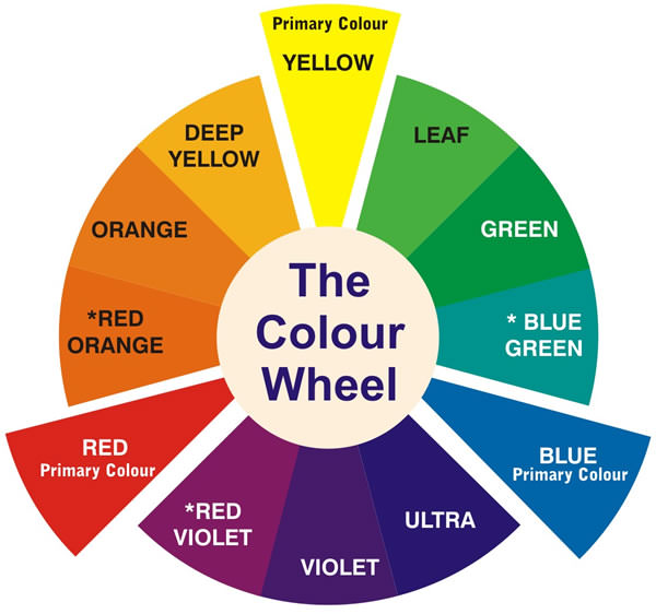
Draw a line through the centre of the wheel, and you’ll separate the warm colours (reds, oranges, yellows) from the cool colours (blues, green, purples).
Warm Colours are generally associated with energy, brightness and action, whereas cool colours are often identified with calm, peace and serenity.
When you recognise that colour has a temperature, you can understand how choosing all warm or cool colours in your home or office can impact the mood or ‘feel’ of the space. Take for example these two artworks by Ronnie Tjampitjinpa:
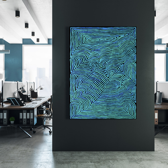
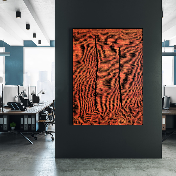
While the artwork to the left beautifully compliments the feature wall in the background, I would say the overall ‘feel’ of the space is cooler, as opposed to the piece on the right which adds warmth to the space.
Simply put, tints, tones and shadows are variations of colours on the colour wheel (used by adding white, black or grey to the colour). Colours mixed with white change tone and intensity. As the digital hang below of Freddy Purla’s artwork ‘Grandmothers Country’ reveals, a lack of brilliant colour does not mean a lack of varied colour.
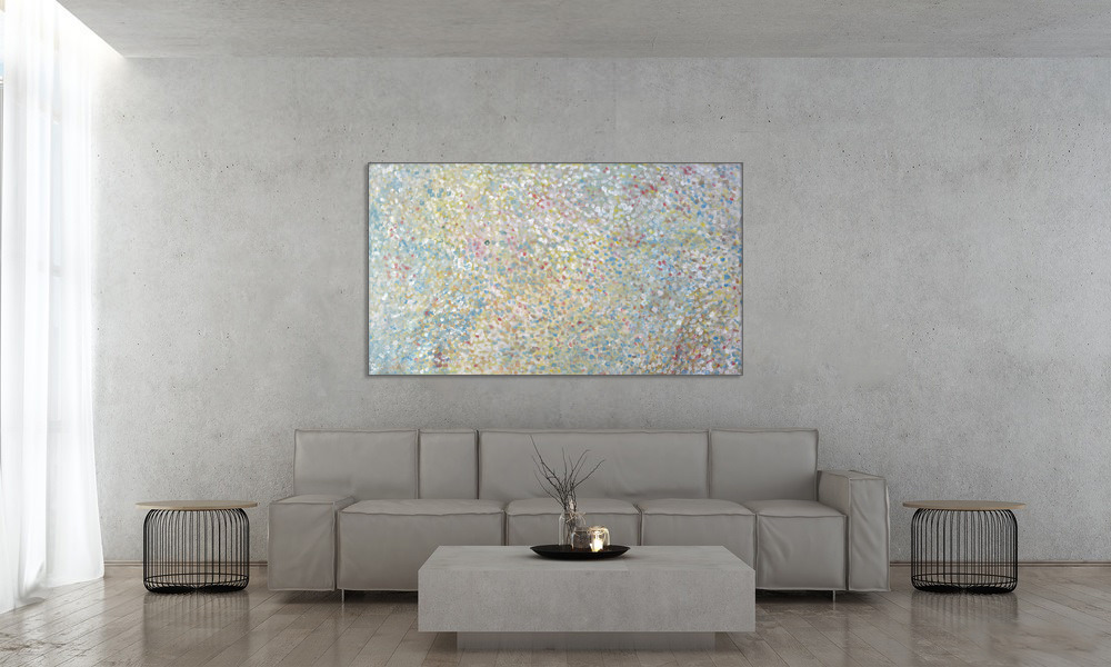
Just because you have a neutral décor, doesn’t mean you can’t add a splash of [subtle] colour!
Using the colour wheel, designers develop colour schemes. Some of the most common terms you may have heard are:
Complimentary Colours - complementary colours are opposites on the colour wheel. Here’s an example of an artwork by Patricia Baker where she has used the complimentary colours red and green:
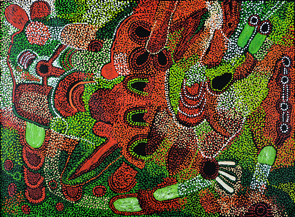
Because there’s a sharp contrast between the two colours, this piece really pops!
Analogus Colours - analogue colour sit next to each other on the colour wheel - red, orange and yellow for example. When creating an analogous colour scheme: one colour will dominate, one will support and another will accent.
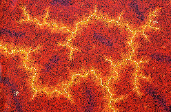
Triadic Colours - triadic colours are evenly spaced around the colour wheel and tend to be bright and dynamic. There is a lovely visual contrast whilst simultaneously being harmonious.
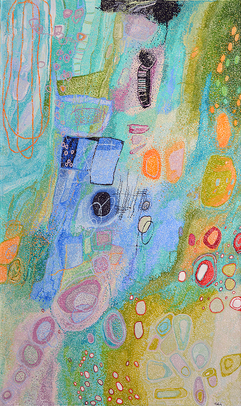
Helen McCarthy Tyalmuty using tridadic colours of orange, green and purple.
Messages Colours Communicate:
Most of us have a favourite colour or prefer some colours over others. This is because it can affect our moods so we surround ourselves in the colours that have a positive impact on our mood.
Wassily Kandinsky, a renowned Russian painter and art theorist, was one of the first pioneers of colour theory and believed the following colours communicate the following qualities:
- Yellow – warm, exciting, happy
- Blue – deep, peaceful, supernatural
- Green – peace, stillness, nature
- White – harmony, silence, cleanliness
- Black – grief, dark, unknown
- Red – glowing, confidence, alive
- Orange – radiant, healthy, serious
What do you think? Don’t forget, colour also has cultural significance, political associations, and religious links.
Colour inspired by surroundings:
We live in a colourful world, a world that acts as the perfect inspirational trigger for design. The rugged beauty of the Australian landscape can be re-created in even the most urban surroundings. Draw inspiration from the unique shades of native elements, such as the flame-orange hues of the desert, olive greens of the eucalyptus trees, or dusty pinks that pop up at the sky at twilight. Combine these punchy shades with complimentary earth tones to bring warmth and richness to even the simplest interiors.
Blues and greens are an intrinsic part of Australia’s diverse bush environment, so why not replicate this palette in an urban residence? Here, the soothing olive greens of melaleucas, and grey-blue of gum trees bring a little of the bush into the city.
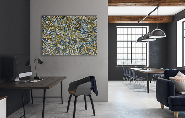 Dulcie Long Pula’s Bush Yam Leaves sits beautifully in this loft apartment.
Composition Considerations:
It is impossible to speak about colour and completely ignore composition, drawing and design. For instance, Rembrandt and Braque used similar colours - Rembrandt to give a sense of light and depth, Braque for flat, decorative effects. Black in a Rembrandt is used in shadow and mysterious distance, quite different from the heavy black outlines and flat areas in a highly stylised Braque still life.
One example from the KOG stockroom are these two brilliant artworks by the highly talented and versatile artist, Helen McCarthy Tyalmuty.
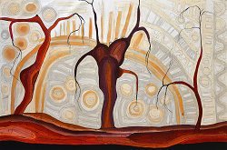
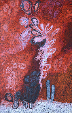
She has used the same two predominant colours in both artworks (red and white), but her composition and painting technique have completely transformed how I perceive the colours. In ‘Marrawuk (The Dry Season) - HMCG0086’ I perceive the red colour as trees in the foreground, whereas in ‘Ngete (Ant Hills) - HMCG0104A’ I see the white accents in the foreground with the red colour receding as if it were the background. Personally, I also think the artworks have very different moods - Marrawuk really does capture that feeling of a still, hot afternoon, whereas in Ngete I feel energised - like the energy of a hundred worker ants are about to burst off the canvas!
Feeling Inspired ? Or even more confused? Either way, not to worry – here at Kate Owen Gallery we have a wonderful team of friendly, informative art consultants who can help you find the perfect artwork to finish off that home or office project. Get in touch with us today – we love hearing from you! We also have a great range of gallery services which you can explore here.